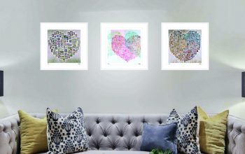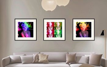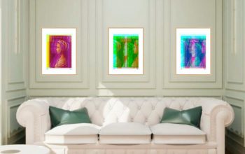
The Stamp Art Shades of ‘Colour’ showcase presents an informative and educational review of the colours used in printing postage stamps and wonderful variety of colour mixtures that are achieved to produce the variety of shades of colour in the art of stamp printing. This selection is presented in Artwork Layouts from which a selected number of ‘Limited Edition’ Fine Artwork prints are available for sale in the Stamp Art Gallery Shop.
In colour theory a tint is a mixture of a colour with white, which increases lightness, while a shade is a mixture with black, which increases darkness. Both processes affect the resulting colour mixture’s relative saturation. A tone is produced either by mixing a colour with grey, or by both tinting and shading. Mixing a colour with any neutral colour (including black, gray, and white) reduces the chroma or colourfulness, while the hue (the relative mixture of red, green, blue, etc. depending on the colorspace) remains unchanged.

Shades of Colour Chart
In the graphic arts, especially printmaking and drawing, “tone” has a different meaning, referring to areas of continuous colour, produced by various means, as opposed to the linear marks made by an engraved or drawn line.
In common language, the term shade can be generalized to furthermore encompass any varieties of a particular colour, whether technically they are shades, tints, tones, or slightly different hues. Meanwhile, the term tint can be generalized to refer to any lighter or darker variation of a colour (e.g. tinted windows).

Colour Theory Charts
In the visual arts, colour theory is a body of practical guidance to colour mixing and the visual effects of a specific colour combination. There are also definitions (or categories) of colours based on the colour wheel: primary colour, secondary colour, and tertiary. Although colour theory principles first appeared in the writings of Leone Battista Alberti (c. 1435) and the notebooks of Leonardo da Vinci (c. 1490), a tradition of “colour theory” began in the 18th century, initially within a partisan controversy over Isaac Newton’s theory of colour (Opticks, 1704) and the nature of primary colours. From there it developed as an independent artistic tradition with only superficial reference to colourimetry and vision science.
The purpose of colour theory range from renaissance fine art to modern commercial advertising. Colours affect our mood and perception.
Colour theory is not new but also seen in old traditions. Colour was mentioned many times in the ancient bible and every colour has its specific definition and interpretation.
Colour can be classified according to
- Warm and Cold
- Receding and Advancing
- Positive and negative
- Subtractive and additive

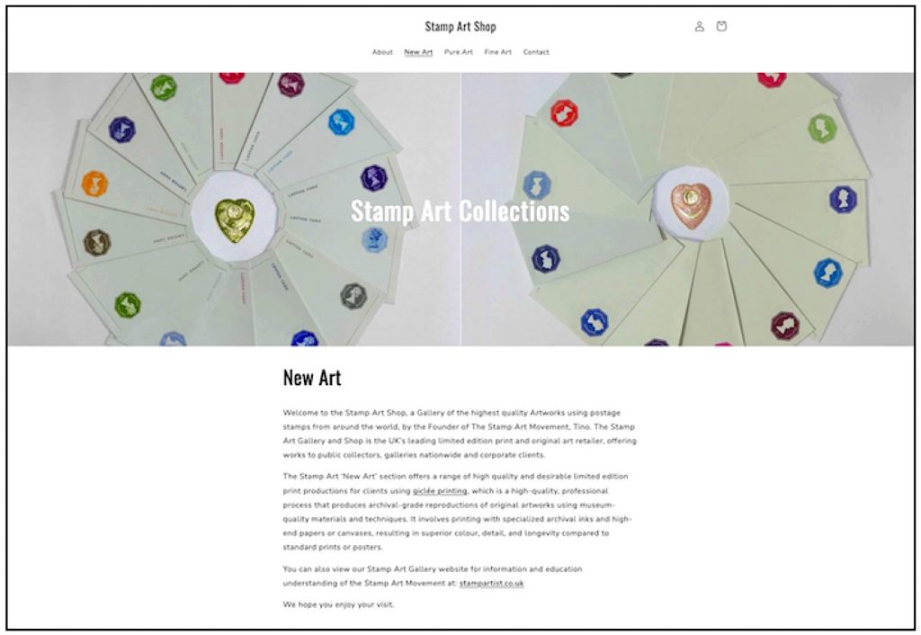
Shades of ‘Colour’ project
KGV 11
11 colours used in the issue from Half Penny to One Shilling. Some colour choices were explored through essays (trials), like the initial plan for a turquoise 2½d stamp,
which was later abandoned. By Tino

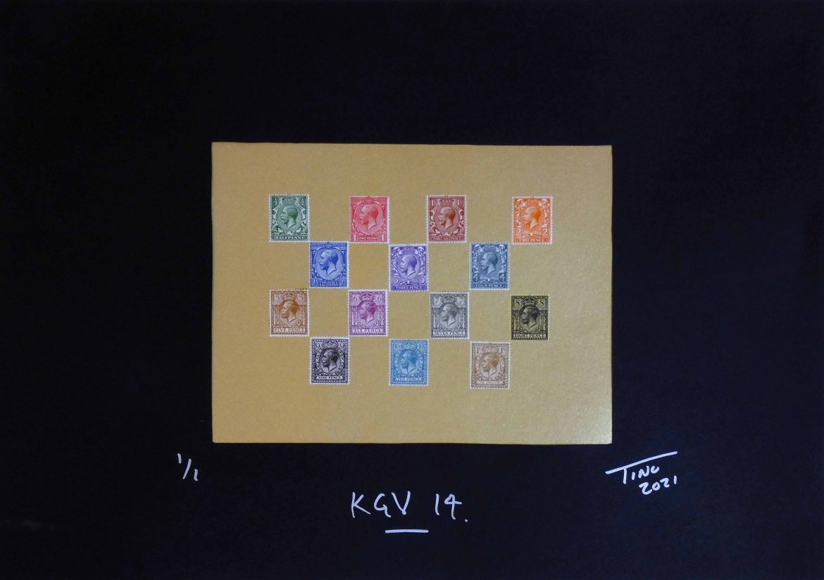
Shades of ‘Colour’ project
KGV 14
14 colours used which show the variety of colours used in the Half Penny to One Shilling issue. Different denominations of stamps were assigned distinct colours to make
them easily distinguishable. By Tino

Shades of ‘Colour’ project
KGV Y36
A block of 6 KGV of Y36 control issue MINT. The violet color chosen for the King George V (KGV) postage stamps was “Tyrian Plum,” a shade of purple. This specific shade was initially intended for the 2-penny (2d) stamps during the reign of Edward VII, but they were
ultimately scrapped due to his death. Later, the same shade of Tyrian Plum
was used for the KGV stamps. By Tino

Shades of ‘Colour’ project
The Jubilee issue of the QV Two & Half D in Purple & Blue.
The Queen Victoria (QV) Two and a Half Pence (2½d) Jubilee issue postage stamp
was purple on blue paper. This specific stamp was part of the 1887 Jubilee issue,
which marked Queen Victoria’s 50th year on the throne. By Tino
Conclusion
Postage stamps from 1840 to 1970 were defined by colour standardization, fugitive inks designed to prevent forgery, and the U PU (Universal Postal Union) colour coding system. These traits made stamps practical, secure, and easily identifiable across borders.
Before multi-colour photogravure and offset lithography became widely available in the mid-20th century, early stamps from 1840 to the late 1880s were mostly monochrome or printed in a single primary colour. As printing technology progressed, bi-coloured stamps (two distinct colours on a single stamp) became standard, paving the way for the vibrant, multi-coloured commemoratives that took over by the
The colours developed and used in postage stamp printing have without doubt influenced the colour palettes of modern day printing methods and the variety of colours we admire in today’s artworks and printed materials.
Private commission for exhibition’s and corporate display, in large format artworks with accompanying messaging are available by request. Please contact info@stampartist.co.uk. for more information.
Fine Art Limited Edition & Numbered Prints
Visit The Stamp Art Shop to Explore A full range of
Fine Art Limited Edition Prints for sale.
Click the Image to go to the Shop.
* Original Stamp Artworks.
* Unique Fine Art Stamp Art Reproductions.
* Stamp Artworks with Fine Mint Stamps within the Artworks.
shop.stampartist.co.uk